Component Library
Render product cards, carts, maps, timelines, booking slots, and other typed UI in chat from plain JSON. Schema-validated, versioned, no custom HTML.
The component library lets your AI actions respond with real UI instead of text. Your action handler returns a component type and a JSON payload; the widget validates the payload against a schema and renders a native component in the chat. Buttons on the component dispatch events back to your page code.
You never write HTML or JavaScript for the components themselves. That constraint is what makes the payloads safe to store and replay in conversation history.
Requires Agent Mode
Components are rendered through AI actions, so your bot needs Agent Mode enabled.
Two ways to use components
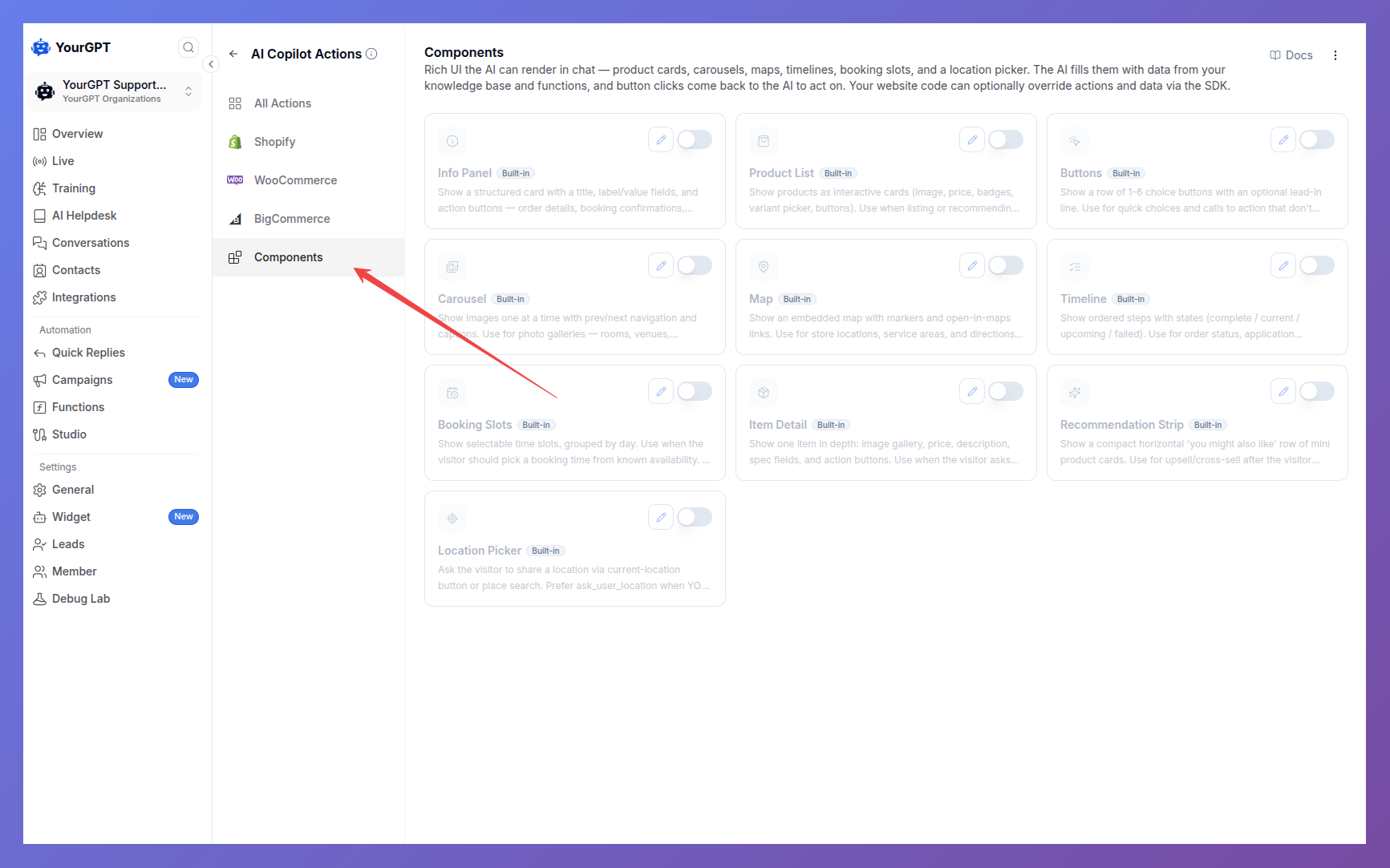
From the dashboard — no code. Components have built-in display actions (show_product_list, show_info_panel, …). Enable the ones your bot should use on AI Copilot Actions → Components. (cart_summary is the exception — it needs your real cart data, so it's SDK-only.) The AI fills them with data from your knowledge base and function results, and button clicks come back to the AI as chat messages to act on. Enabling is the entire setup. If your data is missing something — product links, images, prices — say so in your bot's persona, or the AI will guess a value rather than leave the field out.
From your page — custom data and handling. When the data must come from your API, or your page code should handle the clicks, register your own action instead: your own name, description and schema, plus a handler in your site's code. You don't enable the built-in toggles for this — they're a separate, independent path. Both render the same components, and you can mix them.
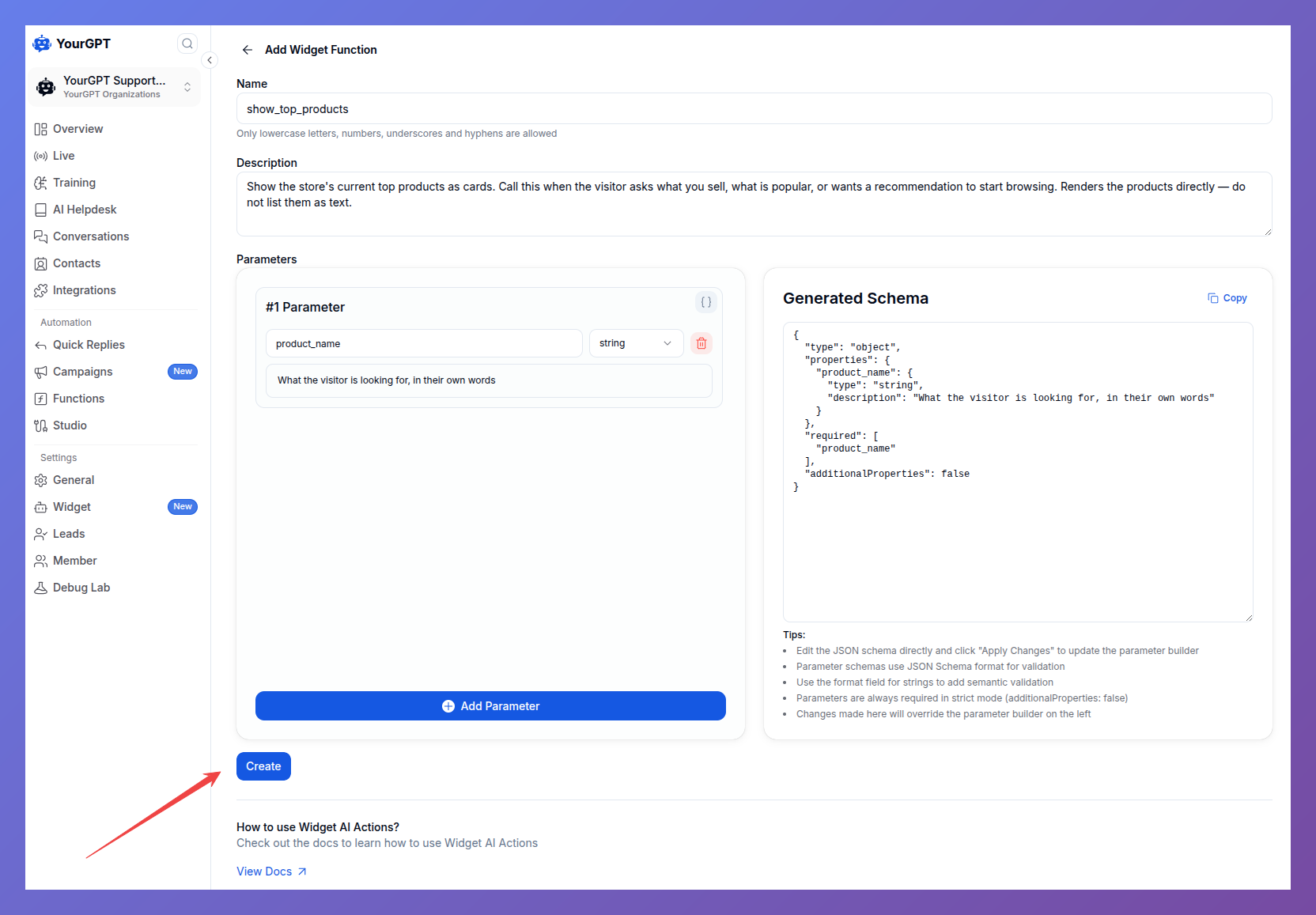
Add a parameter for anything the AI should pass you — a search term, an order id. Leave the list empty if your handler doesn't need one.
Quick start (custom data via SDK)
Two things to get right before the code:
- Create the action in the dashboard first. Under AI Copilot Actions, add a function named
show_top_productswith a description of when the AI should call it and a parameters schema ({ "type": "object", "properties": {} }if it takes none). Your handler only fires for actions that exist there. - Run your code after the widget script loads.
$yourgptChatbotdoesn't exist until then — this is the most common reason a handler never fires.
(function () {
  var script = document.createElement("script");
  script.src = "https://widget.yourgpt.ai/script.js";
  script.id = "yourgpt-chatbot";
  script.setAttribute("data-widget", "<YOUR_WIDGET_ID>");
  script.onload = setupChatbot; // everything below goes in here
  document.body.appendChild(script);
})();
Now register the action and handle the clicks:
function setupChatbot() {
  // 1. The AI calls your action; you respond with a component
  $yourgptChatbot.on("ai:action:show_top_products", async (data, helpers) => {
    const products = await fetch("/api/products/top").then((r) => r.json());

    helpers.respondComponent({
      type: "product_list",
      data: {
        items: products.map((p) => ({
          id: p.id,
          name: p.name,
          price: { amount: p.price, currency: "USD" },
          image_url: p.image,
          url: p.link,
          actions: [
            { kind: "emit", id: "add_to_cart", label: "Add", payload: { product_id: p.id } },
          ],
        })),
      },
      summary: `Showing ${products.length} products`,
    });
  });

  // 2. Component buttons report intent to your page — you own what happens.
  // An async handler drives the button's feedback: spinner while pending,
  // ✓ on success, a failure message on throw (see Acknowledgments).
  $yourgptChatbot.on("component:action", async (e) => {
    if (e.action === "add_to_cart") {
      await myCart.add(e.payload.product_id);
    }
  });
}
summary is what the AI remembers it showed. It's stored with the message and read back on the next turn, so make it descriptive — "Showing 6 products" lets the AI answer "is the second one in stock?". It isn't displayed to the visitor (the component is the response); pass showSummary: true to also render it as a chat bubble above the component. It's the fallback text anywhere the component itself can't render.
Reading the AI's arguments
If your action takes parameters — a search query, an order id — the AI's arguments arrive on the data argument as a JSON string, not an object:
$yourgptChatbot.on("ai:action:search_products", async (data, helpers) => {
  const { query } = JSON.parse(data.action?.tool?.function?.arguments || "{}");

  const products = await fetch(`/api/search?q=${encodeURIComponent(query)}`).then((r) => r.json());
  helpers.respondComponent({ type: "product_list", data: { items: products }, summary: `${products.length} results for "${query}"` });
});
The parameter names come from the schema you set on the action in the dashboard, so query here means the dashboard schema declared a query property. data also carries session_uid and message_id if you need them.
Components
| Type | Use it for |
|---|---|
product_list | A list of things to choose from, with prices and buttons |
item_detail | One thing in depth — gallery, specs, description |
recommendation_strip | A compact horizontal row of suggestions |
cart_summary | Line items, quantities and a total |
info_panel | Label/value rows — order details, confirmations, specs |
timeline | Ordered steps with states — order or request progress |
booking_slots | Pick a time from available slots |
location_picker | Ask the visitor where they are |
map | Show places on a map with an address list |
carousel | Images one at a time with captions |
buttons | A row of choices, no card around them |
Every component takes the same envelope — type, data, summary — so once one works, the rest are just a different payload shape.
product_list
A vertical list of product cards. Only id and name are required per item; every other field renders when present and disappears when omitted.
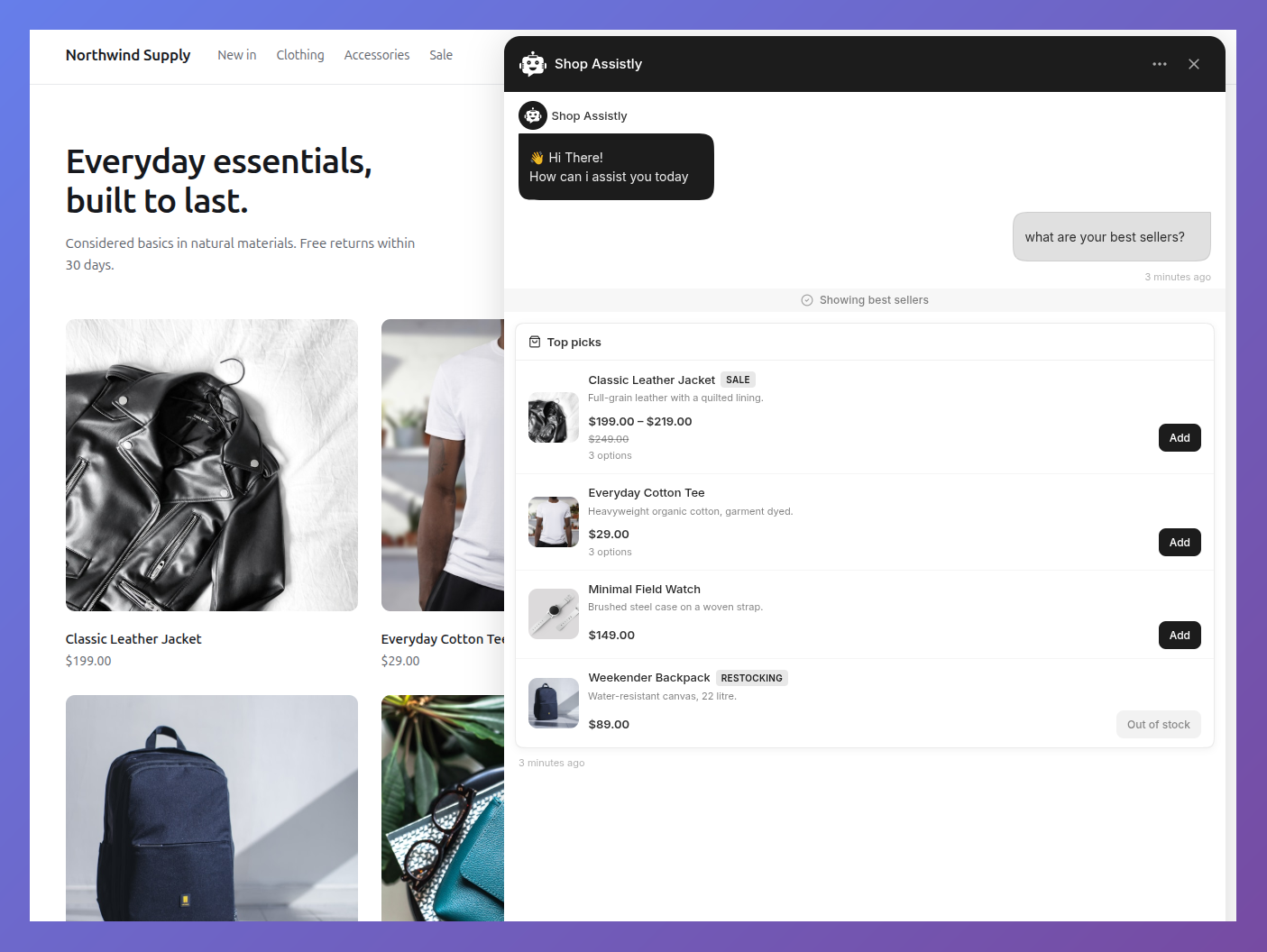
{
  "title": "Top picks",
  "items": [
    {
      "id": 42,
      "name": "Classic Leather Jacket",
      "price": { "amount": 199.0, "currency": "USD" },
      "compare_at_price": { "amount": 249.0, "currency": "USD" },
      "description": "Full-grain leather, quilted lining.",
      "image_url": "/img/jacket.jpg",
      "url": "/products/classic-leather-jacket",
      "badge": "Sale",
      "variants": [
        { "id": "v1", "label": "Black / M" },
        { "id": "v2", "label": "Black / L", "price": { "amount": 209.0, "currency": "USD" } },
        { "id": "v3", "label": "Brown / M", "available": false }
      ],
      "actions": [
        { "kind": "emit", "id": "add_to_cart", "label": "Add", "payload": { "product_id": 42 } }
      ]
    }
  ],
  "actions": [{ "kind": "link", "label": "View all", "url": "/shop" }]
}| Field | Type | Required | Notes |
|---|---|---|---|
items | array | yes | 1–20 items |
items[].id | string | number | yes | Returned in action context |
items[].name | string | yes | |
items[].price | Money | no | |
items[].price_max | Money | no | Renders "price – price_max" when higher |
items[].compare_at_price | Money | no | Strikethrough, only when higher than price |
items[].description | string | no | Clamped to 2 lines |
items[].image_url | string | no | Relative paths allowed |
items[].url | string | no | Makes image and title links |
items[].badge | string | no | Short chip, e.g. "Sale" |
items[].available | boolean | no | false replaces actions with an "Out of stock" label |
items[].variants | array | no | 1–50; see below |
items[].actions | Action[] | no | Max 3 |
title | string | no | List header |
actions | Action[] | no | Footer, max 3 |
info_panel
A structured card for order details, booking confirmations, contact info, spec sheets.
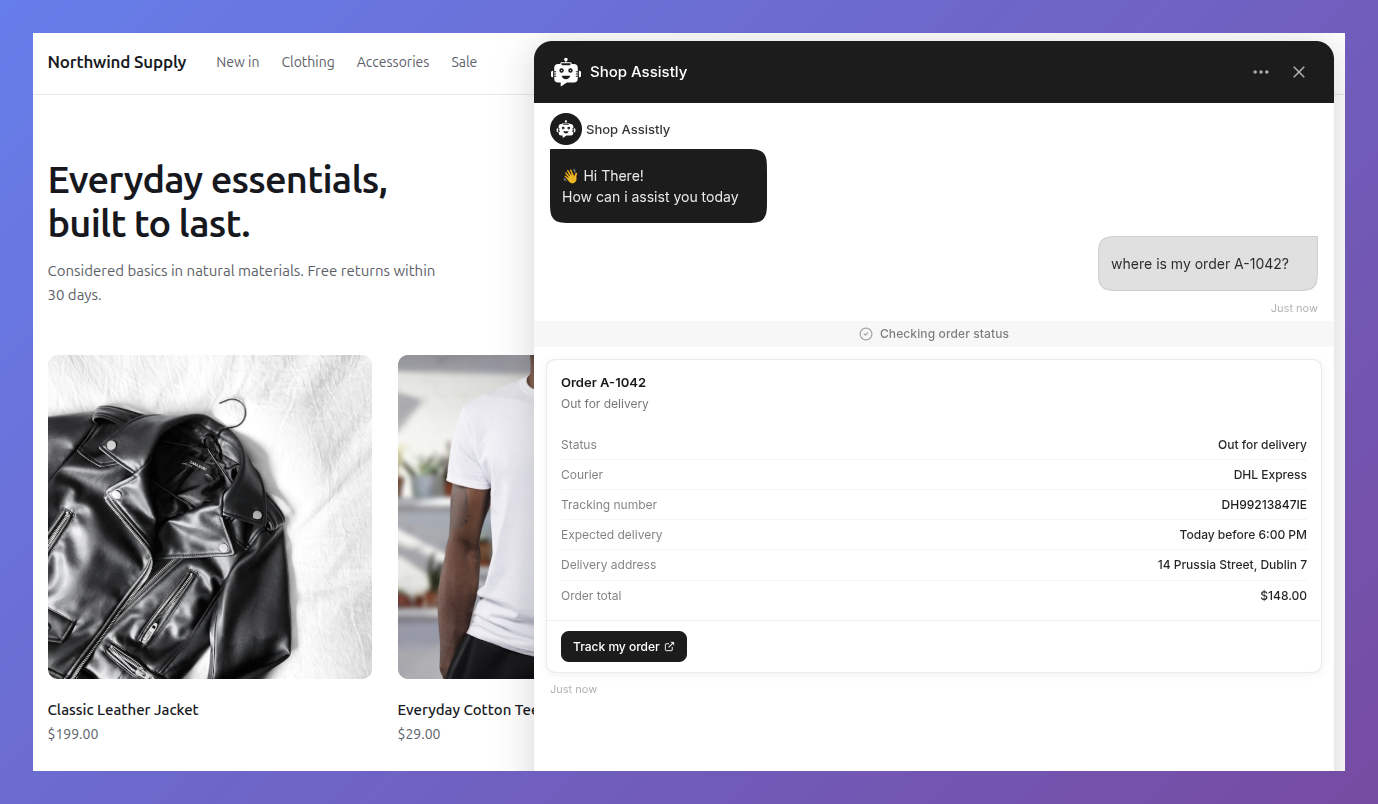
{
  "title": "Order #1042",
  "subtitle": "Placed on Jul 28",
  "fields": [
    { "label": "Status", "value": "Shipped" },
    { "label": "Tracking", "value": "1Z999AA10123456784", "url": "https://track.example.com/1Z999" }
  ],
  "actions": [{ "kind": "link", "label": "View order", "url": "/orders/1042" }]
}| Field | Type | Required | Notes |
|---|---|---|---|
title | string | yes | |
subtitle | string | no | |
image_url | string | no | 44px thumbnail beside the title |
fields | array | no | Max 20 label/value rows |
fields[].url | string | no | Renders the value as a link |
actions | Action[] | no | Max 3 |
cart_summary
A read-only cart: items with quantities and totals, plus up to two actions (typically a checkout link). SDK-only — it needs your real cart data, so there's no dashboard preset.
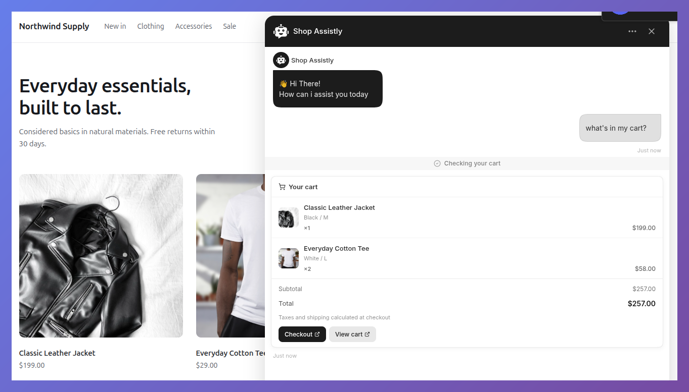
{
  "items": [
    { "id": 7, "name": "Hoodie", "quantity": 2, "options": "Blue / L",
      "line_total": { "amount": 90.0, "currency": "USD" }, "image_url": "/img/hoodie.jpg" }
  ],
  "total": { "amount": 90.0, "currency": "USD" },
  "note": "Taxes calculated at checkout",
  "actions": [{ "kind": "link", "label": "Checkout", "url": "/checkout" }]
}
Required: items (0–30, each with id, name, quantity). An empty items array renders a localized "Your cart is empty" state — actions still show, so an empty cart can offer "Browse products". Optional per item: options, unit_price, line_total, image_url, url. Optional at the top level: title, subtotal, total, note, actions (max 2).
item_detail
A single item in depth: image gallery with prev/next, price, description, spec fields, actions.
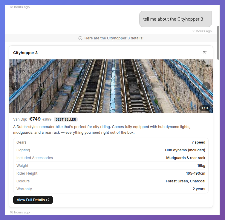
{
  "name": "Classic Leather Jacket",
  "brand": "Acme",
  "images": ["/img/jacket-1.jpg", "/img/jacket-2.jpg"],
  "price": { "amount": 199.0, "currency": "USD" },
  "description": "Full-grain leather, quilted lining.",
  "fields": [{ "label": "Material", "value": "Leather" }],
  "url": "/products/classic-leather-jacket",
  "actions": [{ "kind": "emit", "id": "add_to_cart", "label": "Add to cart", "payload": { "product_id": 42 } }]
}
Required: name. Optional: brand, badge, description, images (max 10), price, compare_at_price, fields (max 12), url, actions (max 3).
recommendation_strip
A compact horizontal row of mini product cards, one optional action each. Use product_list when items need descriptions or multiple actions.
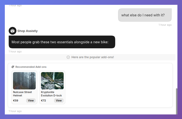
{
  "items": [
    { "id": 9, "name": "Wool Beanie", "price": { "amount": 24.0, "currency": "USD" },
      "image_url": "/img/beanie.jpg", "url": "/products/wool-beanie",
      "action": { "kind": "emit", "id": "add_to_cart", "label": "Add", "payload": { "product_id": 9 } } }
  ]
}
Required: items (1–10, each with id, name). title defaults to a localized "You might also like".
buttons
A row of 1–6 action buttons with an optional lead-in line. No card chrome.
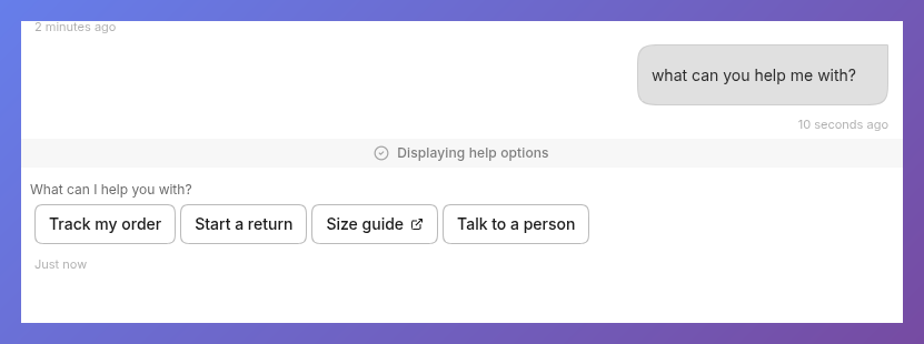
{
  "title": "What would you like to do?",
  "actions": [
    { "kind": "emit", "id": "book_demo", "label": "Book a demo" },
    { "kind": "link", "label": "See pricing", "url": "/pricing" }
  ]
}
carousel
A horizontal slider of image cards with prev/next navigation. Each card shows its caption under the image; tapping a card opens link (or the image) in a new tab.
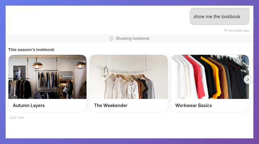
{
  "title": "Room photos",
  "items": [
    { "url": "/img/room-1.jpg", "caption": "Deluxe suite" },
    { "url": "/img/room-2.jpg", "caption": "Sea view", "link": "/rooms/sea-view" }
  ]
}
Required: items (1–12, each with url). Optional per item: alt, caption, link.
map
An embedded map plus a marker list with open-in-maps links. The embed uses a keyless Google Maps iframe centered on center or the first marker; if the host page's CSP blocks the iframe, the marker list still renders.
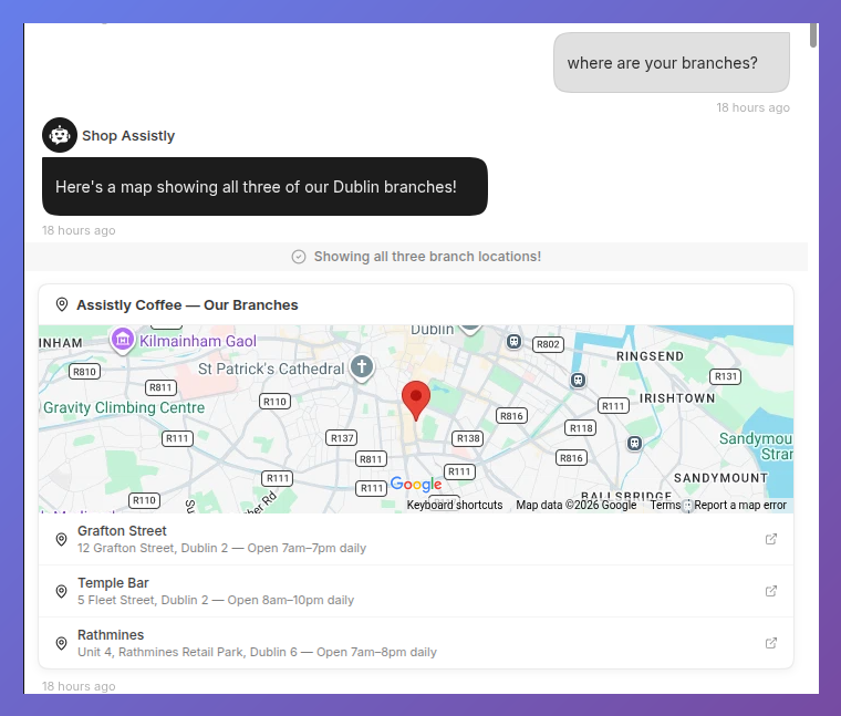
{
  "title": "Our stores",
  "zoom": 12,
  "markers": [
    { "lat": 28.6139, "lng": 77.209, "label": "Connaught Place", "description": "Open 10am–9pm" },
    { "lat": 28.5355, "lng": 77.391, "label": "Noida" }
  ]
}
Required: markers (1–20, each with lat, lng). Optional: title, center, zoom (1–21, default 14), per-marker label and description.
timeline
Ordered steps with states, for order status and progress flows.
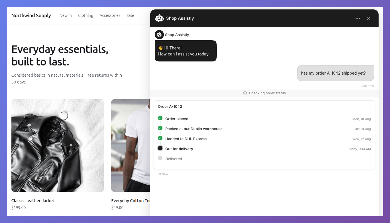
{
  "title": "Order #1042",
  "steps": [
    { "label": "Ordered", "timestamp": "Jul 28", "state": "complete" },
    { "label": "Shipped", "timestamp": "Jul 29", "state": "complete" },
    { "label": "Out for delivery", "state": "current" },
    { "label": "Delivered", "state": "upcoming" }
  ]
}
Required: steps (1–15, each with label). state is one of complete, current, upcoming (default), failed. timestamp is displayed as-is; format dates yourself.
booking_slots
A grid of selectable time slots. Tapping an available slot highlights it and dispatches a component:action event; your page performs the booking.
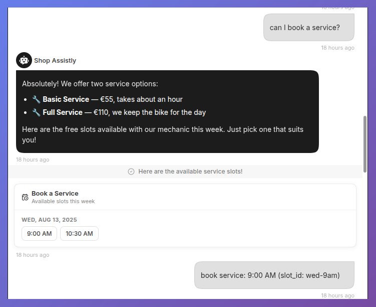
{
  "title": "Pick a time",
  "subtitle": "Times in IST",
  "slots": [
    { "id": "s1", "start": "2026-08-02T10:00:00+05:30" },
    { "id": "s2", "start": "2026-08-02T11:00:00+05:30", "available": false },
    { "id": "s3", "start": "2026-08-02T14:30:00+05:30" },
    { "id": "s4", "start": "2026-08-03T10:00:00+05:30" },
    { "id": "s5", "start": "2026-08-03T15:00:00+05:30" }
  ],
  "action_id": "slot_selected"
}
Required: slots (1–40, each with id and an ISO 8601 start). Slots group by day automatically — each day gets a header ("Sun, Aug 2") and its chips show the time only, so a week of availability reads as days, not one wall of chips. Grouping and formatting use the visitor's locale and timezone; a label overrides a chip's text. available: false renders disabled. With no listener, a selection goes to the AI as a chat message ("slot selected: Sun, Aug 2, 10:00 AM"); to handle it yourself, the event carries { slot_id, start } under your action_id (default slot_selected):
$yourgptChatbot.on("component:action", (e) => {
  if (e.component === "booking_slots" && e.action === "slot_selected") {
    bookAppointment(e.payload.slot_id);
  }
});
Acknowledgments apply here too: return a promise from the handler and a rejection un-selects the slot and shows your error message under the grid. Selection state is visual only and resets on reload — your booking system owns the truth.
location_picker
Collects a location from the visitor: a "use my current location" button (browser geolocation, no key needed) and a place search box.
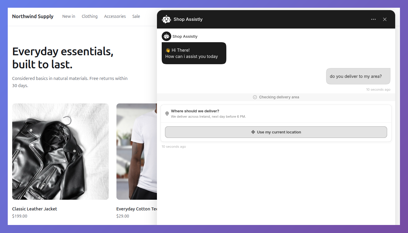
Above is the picker without a Google key — geolocation only. Add a key and a place search box appears under the button; see the setup steps below.
{
  "title": "Where should we deliver?",
  "action_id": "delivery_location",
  "countries": ["in"],
  "bias": { "lat": 28.6139, "lng": 77.209 }
}
All fields are optional: title, subtitle, action_id (default location_selected), allow_current_location, allow_search, placeholder, bias (search near a point), countries (ISO alpha-2, max 5).
Search needs a Google key, set on your page — never in the payload, which is stored in conversation history:
-
Already loading Google Maps JS? The picker uses it automatically, and "current location" also returns a street address.
-
Otherwise set a key once on your page. Enable Places API (New) for it and restrict it to your domain:
<script>window.YGPT_GOOGLE_MAPS_KEY = "AIza...";</script> -
With neither, the search box hides and geolocation still works, emitting coordinates without an address.
Picking dispatches through the acknowledgment pipeline:
$yourgptChatbot.on("component:action", async (e) => {
  if (e.action === "delivery_location") {
    // e.payload = { lat, lng, address, place_id?, source: "geolocation" | "search" }
    const ok = await checkDeliveryArea(e.payload.lat, e.payload.lng);
    if (!ok) throw "Sorry, we don't deliver there yet"; // shown on the picker
  }
});
On success the picker shows the address, a map preview, and a Change button. Selection is visual state — your handler owns what the location means.
No-code alternative: ask_user_location. When the AI needs the location itself and you don't want host-page code, this built-in tool renders the same picker in the composer tray, waits for the visitor, and hands the result straight back to the AI:
AI calls ask_user_location({ question: "Where should we deliver?" })
→ visitor picks (current location or search)
→ AI receives { "Where should we deliver?": "{\"lat\":28.61,\"lng\":77.2,\"address\":\"...\",\"source\":\"search\"}" }
→ { "_dismissed": true } if the visitor declines
The request survives a page refresh, and history replays the answer as a pinned address. Search needs the same Google key as above.
Variants
Use variants to offer one product in several sizes, colours or configurations, instead of listing each one as its own row.
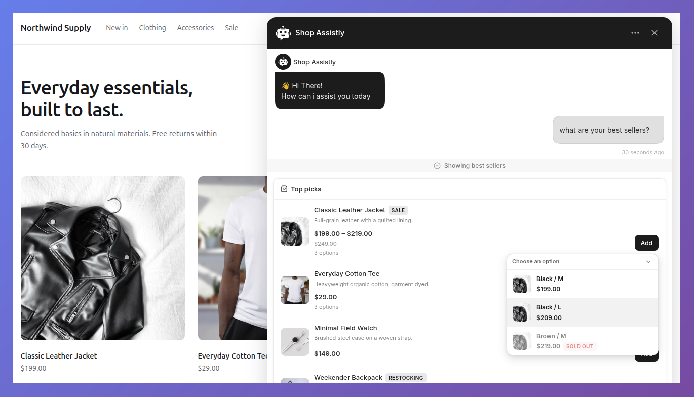
When an item has variants, its emit actions open a picker; choosing one dispatches the action with variant_id and variant_label added to the payload and context. A single variant skips the picker. The card shows an "N options" hint next to the price.
If variants differ in price, set the item's price to the lowest and price_max to the highest — the card shows the range and the picker shows each variant's own price.
Resolve the price on your server
The pick event carries variant_id, not a price. Always look the real price up from that id — never trust a price sent by the browser.
Acknowledgments apply here too: an async handler keeps the chosen row spinning until it settles, success closes the picker, and a rejection shows your message inside it.
| Variant field | Type | Required | Notes |
|---|---|---|---|
id | string | number | yes | Merged into the action payload as variant_id |
label | string | yes | e.g. "Black / M" |
price | Money | no | Falls back to the item price |
compare_at_price | Money | no | Strikethrough when higher |
image_url | string | no | Falls back to the item image |
available | boolean | no | false renders a disabled "Sold out" row |
Shared types
Money
{ "amount": 19.99, "currency": "USD" }The widget formats amount + currency (ISO 4217) with the visitor's locale. If your backend only has display strings, pass formatted and it wins:
{ "amount": 19.99, "currency": "USD", "formatted": "$19.99" }Actions
Two kinds. link opens a URL. emit reports an intent — with two handling modes:
- Default (no code): if your page has no
component:actionlistener, the click is sent into the conversation as a visitor message (e.g. "Add: Classic Tee — Black / L (product_id: 42)") and the AI acts on it — calling your project's functions, confirming, continuing the flow. - Override (your code): register a
component:actionlistener and it receives the event instead — instant, silent, no AI turn. This is the right mode when your page should call your API directly.
{ "kind": "link", "label": "View order", "url": "/orders/1042", "new_tab": false }{ "kind": "emit", "id": "add_to_cart", "label": "Add", "payload": { "product_id": 42 } }new_tab defaults to true. payload is arbitrary JSON, delivered verbatim. Both kinds accept disabled: true to render the button disabled.
Acknowledgments
Return a promise from your component:action handler and the widget drives the button's feedback for you: a spinner while it's pending, a check on success, and a failure message inline on rejection.
$yourgptChatbot.on("component:action", async (e) => {
  if (e.action === "add_to_cart") {
    await myCart.add(e.payload.product_id); // button spins until this settles
    // resolve → ✓ on the button
    // throw "Only 2 left in stock" → that text shown on the component
    // throw new Error("anything else") → generic localized failure message
  }
});
Visitors only ever see text you chose to show them:
- Shown verbatim — a string rejection, or an Error carrying a
userMessageproperty:throw Object.assign(new Error("SKU-42 depleted"), { userMessage: "Only 2 left in stock" }). - Shown as a generic "Something went wrong" — everything else, so network errors and internal API text never leak. The real error goes to the console.
A handler that returns nothing gets a brief "sent" flash, and one that hangs fails after 10 seconds — a timeout is never shown as success.
The component:action event:
$yourgptChatbot.on("component:action", (e) => {
  // e.component  "product_list"
  // e.action     "add_to_cart"        (your id)
  // e.payload    { product_id: 42 }   (your payload)
  // e.context    { item_id: 42, item_name: "Classic Leather Jacket" }
});
context tells you where in the component the click happened: product actions carry item_id/item_name (plus variant_id/variant_label when a variant was picked), item_detail actions carry item_name. List-footer and buttons actions have no narrower scope, so they omit it.
Validation
Payloads are validated when you call respondComponent, and again when conversation history replays.
-
A missing or invalid required field rejects the whole component. It is not rendered, the AI receives a plain-text failure so the conversation continues, and the browser console lists every violated path:
[YourGPT] Component "product_list" rejected — fix the data passed to respondComponent: - items[0].name: Invalid input: expected string, received undefined -
Optional fields degrade one by one.
{ "items": [{ "id": 1, "name": "Widget" }] }is a complete, valid product list. -
Unknown keys are stripped silently. If an optional field never appears, check its spelling first — a typo is dropped without a warning.
-
URL fields (
url,image_url,link) accepthttp,https,mailto,tel, or a relative path. Anything else is rejected, which is what keeps a stored payload safe to replay later.
Styling
Components inherit the widget theme (colors, fonts) automatically. For deeper changes, every component carries stable class names you can target from your site's CSS or the dashboard's custom CSS field — these names are part of the public API and won't change, unlike the generated ones next to them.
| Class | Where |
|---|---|
ygpt-c | Every component root |
ygpt-c-<type> | Component root, e.g. ygpt-c-product-list, ygpt-c-info-panel |
ygpt-c-header | Header row |
ygpt-c-item | Repeated rows/cards: products, fields, cart lines, markers, steps |
ygpt-c-price | Price blocks |
ygpt-c-action | Action buttons (ygpt-c-action--primary on the first) |
ygpt-c-slot | Booking slot chips |
/* Example: brand the primary action and square off the cards */
.ygpt-c-action--primary { background: #1a1a2e; border-radius: 4px; }
.ygpt-c-product-list .ygpt-c-item { padding: 14px; }
Language and RTL
Text in a component comes from two places, handled differently:
- Your data (names, labels, captions, titles): the widget renders it verbatim, so supply it in the visitor's language. AI-generated arguments already follow the conversation language. If your handler builds strings itself, add a
user_localestring property to your action's schema — the AI fills it with the visitor's chat language ("en","fr", …) and you can localize from there. - Built-in chrome ("Total", "You might also like"): translated by the widget's own language setting.
Numbers, currencies, and slot times are formatted with the widget's active locale, not the browser locale — a visitor chatting in French sees 199,00 € even on an English browser. timeline timestamps are the exception: they render as-is, so format them yourself.
Right-to-left languages work without configuration. When the widget language is Arabic or Hebrew, components mirror automatically — layout and price alignment follow the text direction.
Versioning
Each payload is stamped with the schema version it was written with, so old conversations keep rendering after a schema changes. You don't manage any of this — emit the current shape and the widget handles the rest.